Beacon Merchandise
Breast Cancer HI-VIS Shirts
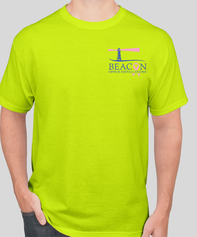
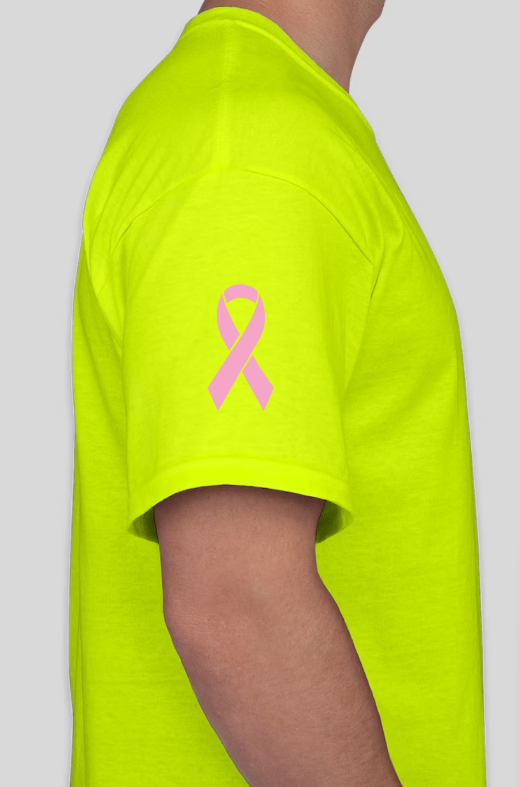
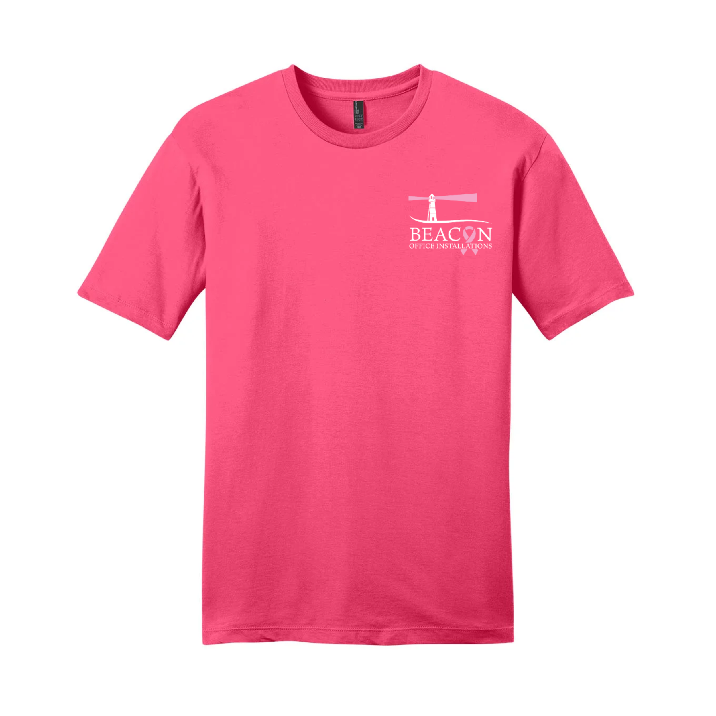
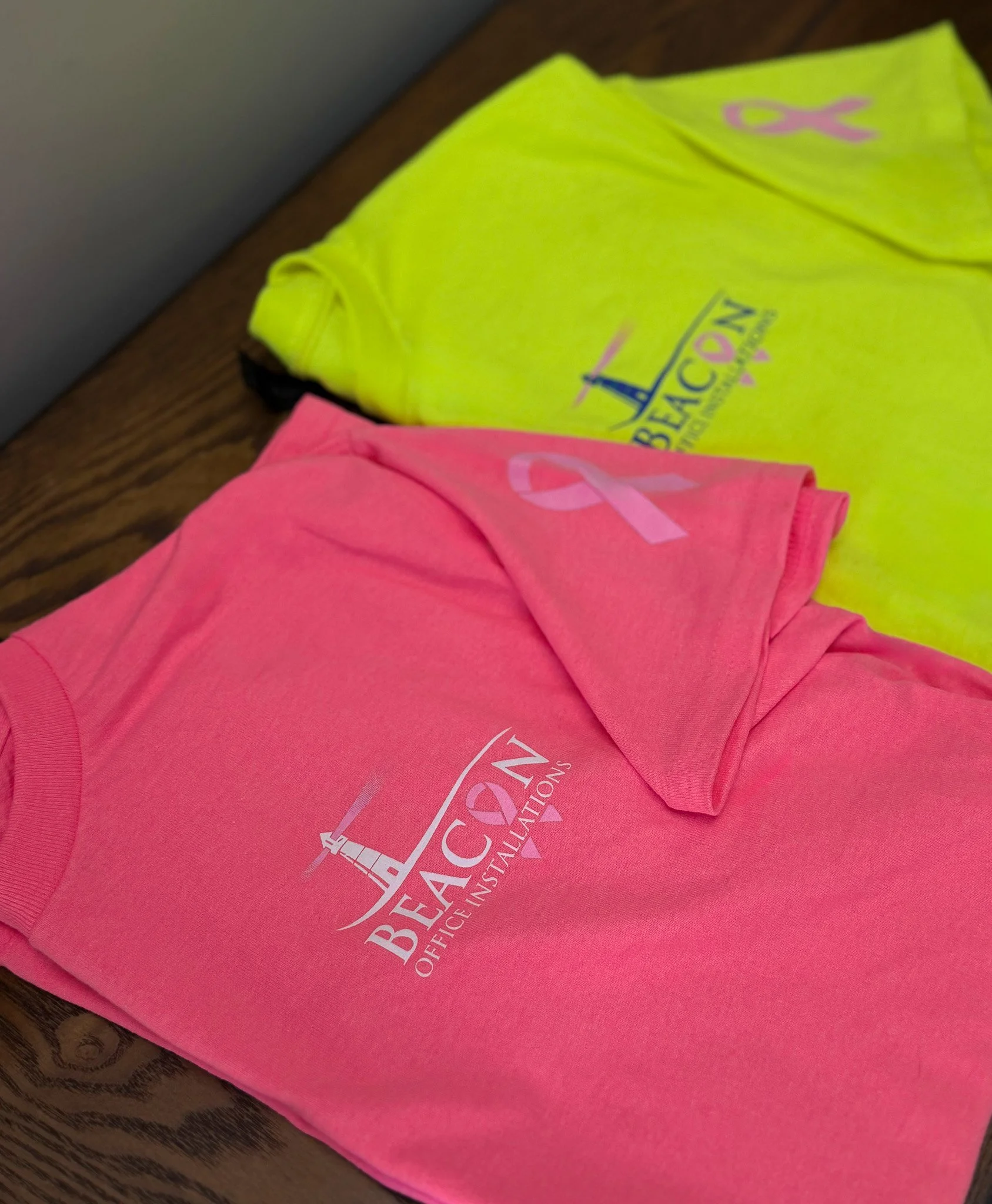
This custom logo was developed for Beacon Office Installations as part of their Breast Cancer Awareness campaign. The design integrates the company’s iconic lighthouse imagery with a pink beam of light and a stylized pink ribbon seamlessly forming the "O" in "BEACON." This subtle yet powerful visual communicates the company’s support for breast cancer awareness while maintaining brand identity. The logo was applied across digital and apparel formats, including high-visibility and awareness-themed t-shirts, ensuring the team can wear them to job sights, and show their support.
Beacon Merchandise
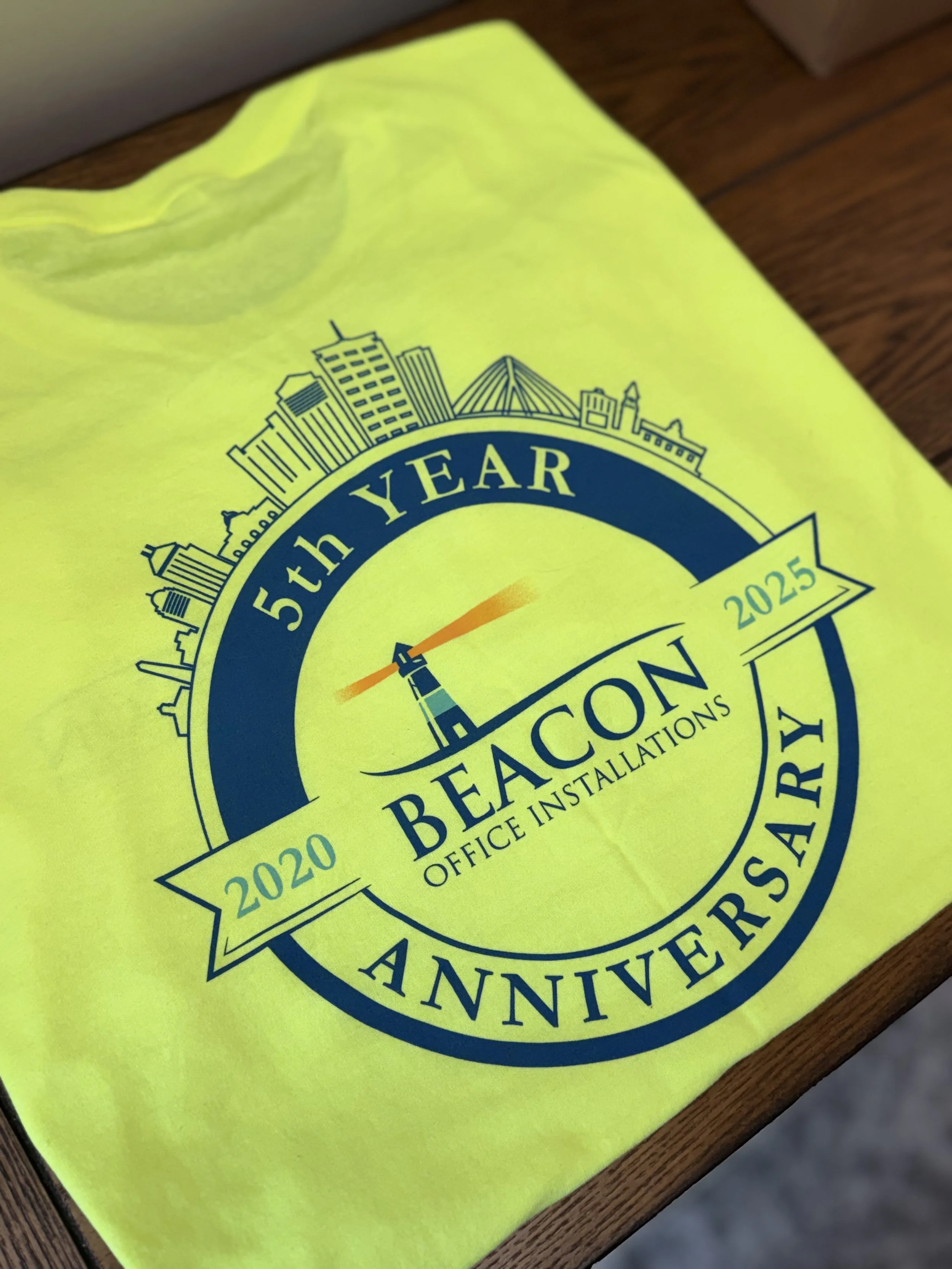
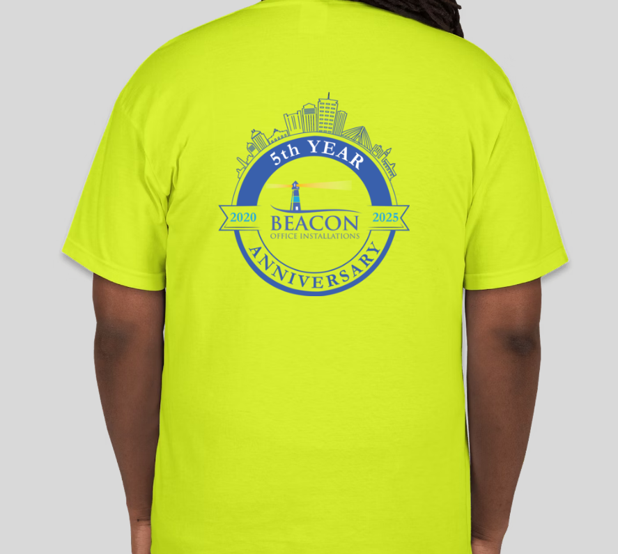
5 Year Anniversary HI-VIS Shirts
To commemorate Beacon Office Installations’ 5-year anniversary, I designed a celebratory logo that honors the company’s roots in Boston. The design incorporates a stylized Boston skyline to acknowledge the city’s role in their journey and growth. Maintaining brand consistency was key, so I used the company’s established color palette and typography throughout. The logo was also adapted for wearable merchandise, reinforcing brand visibility and pride among employees during the celebration. This project highlights my ability to create versatile, event-specific branding that aligns with a company’s core identity.
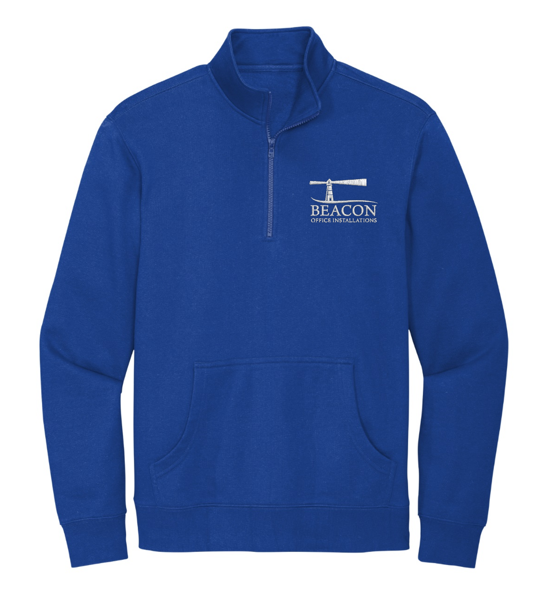
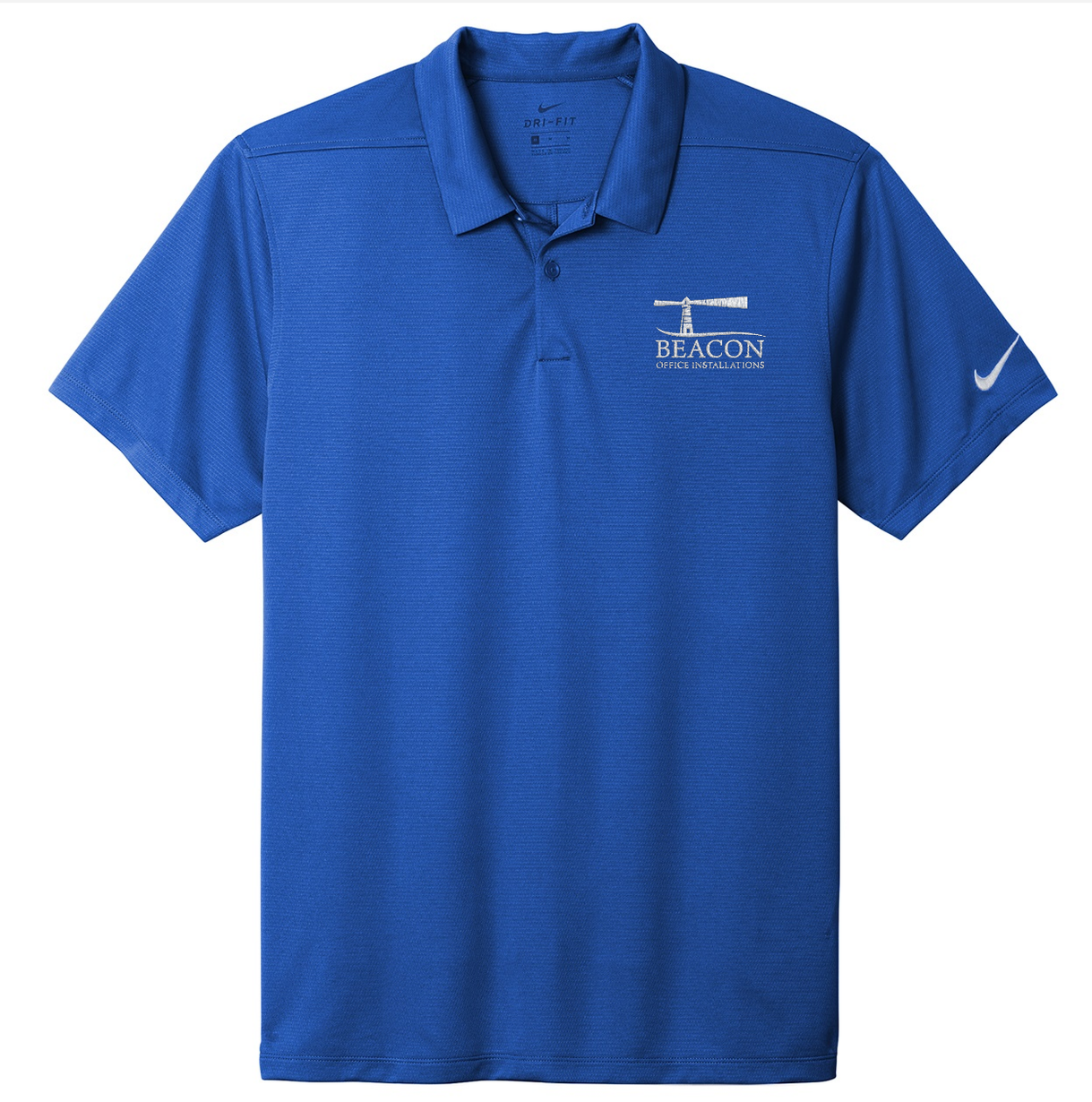
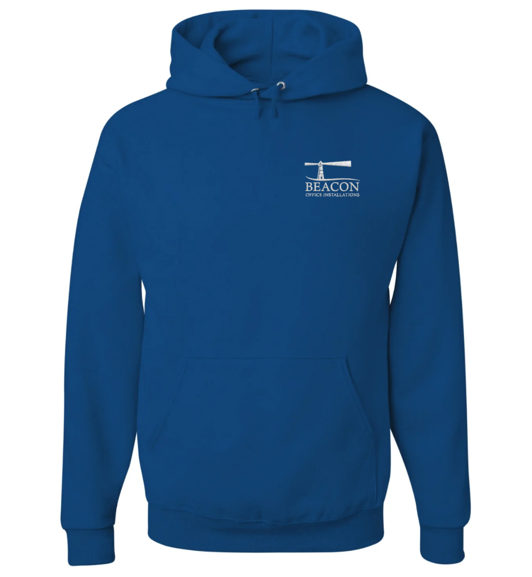
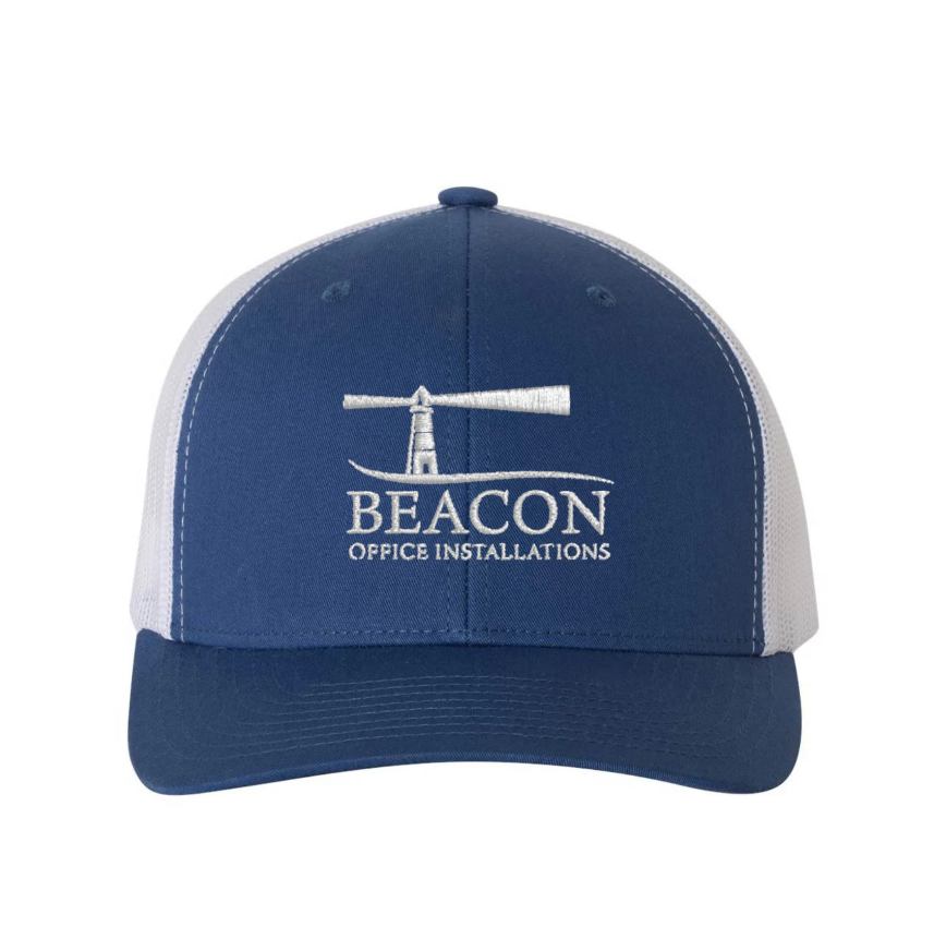
Beacon Merchandise
Navy Blue Line
The Blue Line project was one of the first merchandise initiatives I led after joining Beacon Office Installations. Since Beacon’s primary logo uses three colors, navy, blue, and yellow, the range of viable merchandise colors was limited. To expand their options, I created a clean, all-white version of the logo. This allowed us to produce merchandise in Beacon’s signature navy without compromising the visibility of the logo or integrity of the brand.